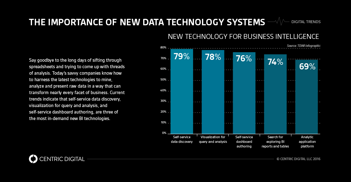
Take a look at how interactive data visualization works in action and what it can do to digitally transform your company.Research has shown how much faster visual information is sent to your brain, which is a key reason why visually showing data has become so popular. A visual representation of data or information also solves the issue of time and effort for others to review and digest data, as well as make decisions and choices.We are now able to not just see the data in a compelling, easy and interesting format, but also interact with the information in a visual way that helps us uncover new details and findings. With the right technology or dashboard in place, all we need to do is click and explore the most interesting or relevant segments of the data and watch as it tells a new story.
Seeing interactive visual data in action
Similar to getting behind the wheel of a Tesla, you can’t really understand the power of interactive data visualization until you immerse yourself in it. Fortunately, there are several companies who have done remarkable online renderings of interactive data that you can take for a spin.For a fascinating look where migrants come from and where they go, based on data from international migrant stock, check out People Movin. This visualization allows users to really dig in deeper to the data. If you're going on the site and want to see the top ten, it's there for you, but if you want to drill into specific countries you can do so as well. Taking things one step further, imagine if users could choose a country that interests them and see, more specifically, where migrants are moving—this could revolutionize moving patterns and potentially even shift immigration behaviors.Similarly, the New York Times report on the relationship between money and race with educational success has similar functionality. Of course, such data may be obvious to some, but the ability to drill down into the information in a simple, visual way certainly might garner broader interest. What if readers could find their school district specifically and compare it to others in an engaging, interactive way? Not only will the visualization inform, but its responsiveness to user specifics can take it to a higher level.Another great look at interactive data visualization in action can be seen with Eater’s interactive heat maps. Not only can readers see the map come alive in real time, they can click on a specific icon on the map and be sent directly to the restaurant details on the page. If Eatery took this one step further and made it so readers could compare restaurants by price, or type of cuisine, reviews or other information, then it could have a staggering impact on San Francisco area restaurants.
Understanding The Benefits
Interactive data visualizations can impact meetings in multiple ways beyond enabling quick, easy access to data. It also enables succinct communication of that data, as well as the ability to compare information, review specific slices that are relevant, and even use predictive forecasting and modeling to enable better decisions.But it can also work by enabling you to better articulate and demonstrate the value of your point. Let’s say you need to determine how to allocate funding or other resources to a need or demand. With interactive visual data, the message can be clearer, and presented in a much easier, digestible way—while increasing the likelihood of engagement with your audience. Through visualizations there is a much better chance everyone is truly paying attention to or understanding the information. It’s no secret that the power of persuasion lies heavily in what we see, even more than what we hear or read.Statistics demonstrate that the average person makes a decision about what they see within a matter of seconds—in fact, 90 seconds is considered to be the maximum. Creative, innovative, and interactive data visualization can not only help make a case for a direction or decision within an organization—it also has the potential to enable decisions to be determined and reached faster.
Leveraging the Tools and Technologies To Get The Job Done
It’s easy to assume that data visualization might take extensive resources or excessive time versus providing and reviewing data in traditional formats. However, there are a range of plug-and-play tools and resources to help ease and efficiency. You can also reuse or repurpose the visualizations you create in-house, where the initial effort to visualize data might take away some heavy lifting, but scale in ease and simplicity thereafter. There are a number of ways to visualize data as well. The key is to find what formats make sense for your organization, its data and teams. From there, you can leverage available tools and resources to tap into the strength of visuals to benefit your bottom line.
Contact Us
Centric Digital is no longer active. This site is preserved as an archive. For inquiries, please fill out the form.
© Centric Digital 2025
