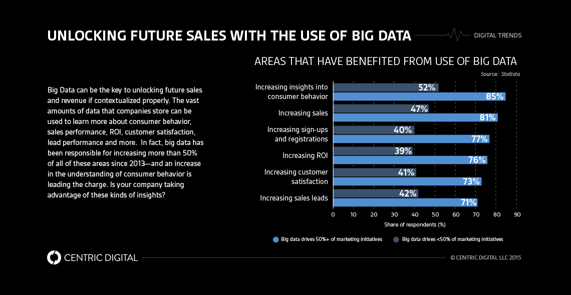
As companies try to make sense of the vast amounts of data they’ve collected, data visualization becomes crucial. The contextualization and execution of this information is really where the money is—but how do you get started?Change is a challenge for any company, but the businesses who adapt are the ones who tend to thrive. One of the major changes companies are faced with today is the vast amounts of data available at their fingertips and the insights all this information can provide. While businesses know this data is a gold mine, many are having trouble finding strategic ways to sift through so much information and present it in an impactful way.Enter data visualization. This is no longer an approach reserved for digital companies like Facebook or Google—big data visualization is a strategic approach that is tremendously helpful for all companies in capturing the proper insights to make sound business decisions. Instead of sifting through spreadsheets, a business can present trends and information in a visually appealing way that will make sense to any customer, employee, stakeholder or board member.Yet, creating big data visualization capabilities for your company takes a lot of work. It’s not as a simple as creating a few dashboards and charts—it must be done the right way.
Four elements to displaying data
There are four simple elements to keep in mind when starting a data visualization strategy. These elements are the foundation of your strategy and will ensure your presentations will capture the attention of the intended audience.When creating a visual dataset, it’s important to:
- Analyze the data
- Analyzing and evaluating the data is important to understanding its type such as: geo-location, text, dollars, grades, completion percent, etc. It also helps to clarify the time period the data captures—whether it’s monthly, quarterly, daily, etc. This information will determine the visual approach you should take.
- Show a compelling visual
- The visuals you choose to show depend on the type of data available. If, for example, you want to show a trend of dollars spent on a daily cup of Starbucks over someone’s lifetime, then a line graph would be more compelling than a pie chart.
- Tell the story
- The biggest hurdle for data visualization is confusion, so clarity is vital. The story you’re telling the audience must be clear and relevant.
- Engage your audience
- Knowing your audience will help your team deliver the type of visualization that speaks to their level of interest. Keep in mind the business segment that this information is important too. Finance will need KPI’s and visuals that are relevant to their business unit, execs will need overall figures, and sales will require performance metrics.
While these steps seem simple enough in theory, it’s a bit more difficult when put into practice.
What to avoid
Another way to approach data visualization is knowing what not to do. Here are a few things to avoid:
- Poor data interpretation and visuals
- Using confusing and poorly thought-out visuals will distract your audience from the real message of your data. Take a look at these visualizations for inspiration on what not to do.
- Intimidating visualizations
- Anything too busy or bold can be an immediate turn off turn—especially if you have people in your audience who aren’t mathematically or data inclined.
- Unfair side-by-side comparison
- There’s a tendency to want to present multiple data sets in one section of a presentation—and this is particularly problematic with side-by-side pie charts.
- Overly complex visuals
- If a visual representation takes more than a glance to grasp the main point, then it may be time to streamline. You want your audience to get a takeaway from the visual quickly and efficiently.
Approaches to consider
If you’re having trouble determining what kind of visualizations to create, we have a few ideas of successful approaches that have worked well for our clients in the past. These include:
- Use available data in creative ways
- The type of data you collect can determine the types of visuals you can present. Geographical data, for example, can be easily shared and viewed as a heat map that is approachable to all. The NYPD recently decided to embrace the digital age by creating an interactive crime heat map available to the public, which has been effective in allowing civilians to see what goes on in their neighborhoods.
- Breakdown of information
- There are different ways to present the data that will make a much larger impact on your target audience. If you have a stat that says 29.1 million Americans have diabetes, instead of simply stating this fact, you could show 10% of the U.S. population to further emphasize your point.
- Eye-catching infographics
- These are great for telling a visual story that gets your audience engaged in the information you’re trying to share. This 7 Steps to Digital Transformation infographic is a great example of a design that effectively presents the data in a compelling way.
- Methods for time series data
- If your data set has specific time dimensions, you can use this to your advantage. An interactive example of this in action is the how the data is presented in the WSJ’s The Billion Dollar Startup Club.
Data visualization is an important way to engage your audience/business unit and tell a compelling story that can assist in driving business results. By defining what’s important for each prospective dashboard user, those audiences will be better suited to make more informed and efficient business decisions. While the above tips can aid your strategy, calling on an expert to create an impactful program can take your data visualization to a whole new level of excellence.
Contact Us
Centric Digital is no longer active. This site is preserved as an archive. For inquiries, please fill out the form.
© Centric Digital 2025
