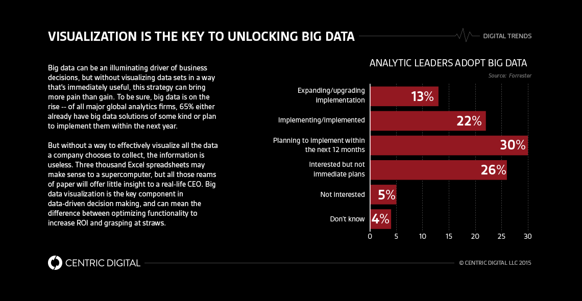
Big data presents a powerful opportunity for companies to drive decisions with quantitative insight. Yet, it’s critical that companies visualize that data and tell its story in a useful way.Companies around the world are investing in big data initiatives to enhance their digital strategies and improve performance. Already, 35% of global analytics leaders have implemented or are implementing big data solutions, and 30% more plan to do so within the next year.Unfortunately, much of that data -- along with the money spent collecting it -- will go to waste on poor presentations that fail to drive decisions because they fail to visualize the data in compelling ways. Equally important as the data itself are the ways in which companies display it. Without an effective way to analyze data, depict its analysis, and tell that story, it is of no use to companies.
Diving Deep
The reality is that, aside from data scientists and CIOs, most employees (and C-suiters) aren’t familiar with data and visualization techniques, which makes visualization key -- spreadsheets are hard to read, especially when they contain lots of data. Choosing the right type of visualization is an art form in itself, as the wrong strategy can actually distract from the pattern you’re trying to illustrate by being too cumbersome, complex, or indicative of irrelevant trends.When done correctly, data visualization should be engaging to an audience at the appropriate level of expertise. Speaking with WIRED, Michal Migurski explains that “Data visualization is a relative term…always referring to the next thing coming over the horizon.” In this way, visualization techniques need to be as dynamic as the information they describe. Ideally, they can accommodate future projections (of multiple-case scenarios), track changes over time, and suggest best courses of action.
Taking Shape
In the last decade, some visualization methods have emerged as clear winners. Many take the form of infographics, which clarify complex patterns through intuitive images and charts. They can also take a rather dull set of information and liven it into a compelling boardroom presentation. However, infographic creators must be careful that the charts they create have sufficient depth and usefulness -- infographics always run the risk of promoting superficiality and flare over substance.For data that evolves in real-time, companies may prefer a big data dashboard. This is a customizable grouping of charts and figures that displays constantly updating and relevant information. In the most simple terms, it’s a speedometer for your company. But regardless of location, a graphic’s form will be dictated by the kind of information it presents.Geographical data, in particular, is amenable to visualization -- Google Maps is easily the best known example. But other things, like population statics and location-based trends, can be turned into a heat map, such as what the NYPD offers for crime statistics. Not only is this type of visualization impactful and easy to read, it’s also eminently sharable. For brands seeking to localize their content or product, geographic visualizations can be an effective way to target demographics.
Chart a Heading
But as Gartner notes, data is inherently “dumb,” and doesn’t tell you anything until you’ve really worked with it. In other words, the story doesn’t come attached to a set of data with box and bow. Part of the task of visualization is combing through datasets to discover what information is actually useful and presentable. In this way, actually visualizing your data in graphic form is the last and least important step in the big data action chain -- if data doesn’t drive decisions, it shouldn’t make if off the spreadsheet.Companies that use big data to effectively drive digital strategy are those that know how make data talk. As dull as number-crunching can seem, you have to dive through vast troves of information if you want to bring something vibrant and engaging to the surface.
Contact Us
Centric Digital is no longer active. This site is preserved as an archive. For inquiries, please fill out the form.
© Centric Digital 2025
