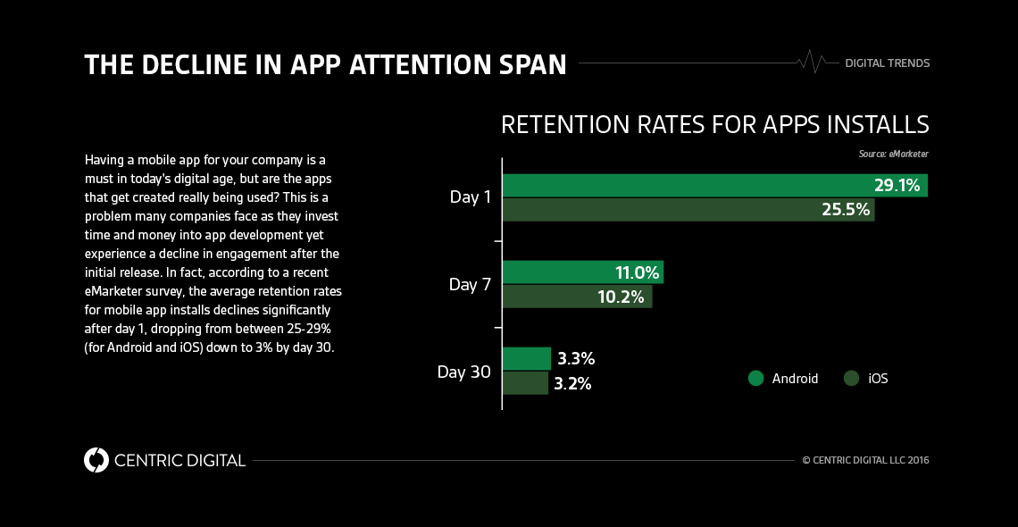
Is the UX design of your mobile apps driving engagement or driving users away? Many companies offer mobile applications for their smartphone-using audiences, but how many of them put out a quality product? Some apps provide no extra value compared to the organization's mobile website experience and others take an overly promotional approach that actively disengages any users. Only 3 percent of apps stay on a smartphone after a month, says eMarketer, so your app faces a challenging road to retention. Improve your chances of capturing customer attention by following these UX design principles in six key areas for an engaging mobile experience.
Intuitive User Interface
Your customer base uses apps for 85 percent of their smartphone usage time, reports Digiday, and overall app usage continues to grow. With millions of apps available, you must provide an intuitive interface that's easy to pick up and lets the user see the value of your app quickly. If they can't figure out what your app does or how to get to the functionality promised in the download description, your audience heads straight to the uninstall button.Put yourself in your customer's shoes and look at your app menu. Do you have a hard time figuring out where to go due to unclear labels or confusing menu structures? Change your layouts and accompanying text so users immediately get to their intended location. Keep the number of menu subcategories and other nested elements small so your customers don't tap through five screens to reach their end goal. Pair your simplified design with back and home buttons for better overall navigation. The back option should take users back a single step, while home lands them on your app homepage.
Simple Onboarding Process
Does your app require registration for full functionality? Don't create a complicated onboarding process that loses your customer's attention. Offer a seamless and friction-free sign-up experience for new users. Your first step is clearly marking the registration form from the sign-in form. You cut down on consumer confusion when you guide them to the proper area.Your next usability challenge is password creation and management. You're going to lose users at this step if you have password requirements that aren't properly indicated or multi-step password creation. Avoid getting hung up on this step with third-party login APIs, such as Google or Facebook, or simple authentication processes.
Seamless In-App Purchases
Can users purchase products, services or other items through your mobile app? An excellent UX in this area helps build customer confidence in the payment process. If customers encounter difficult-to-use mobile app elements or errors when checking out, they won't feel comfortable handing over their credit card information.Start by improving the usability of the shopping experience. Let the user quickly look over their previous order information, as well as any in-app searches they performed previously. Mobile shoppers may have a good idea of which product they want, but they need to finish the final part of their decision-making process. Comparison features help these buyers figure out exactly which products work best for their needs.You face a critical area with the payment process itself, as consumers have high expectations for checkouts. Provide as many payment options as you feel comfortable supporting, including third-party options such as PayPal and mobile payment services. The buyer shouldn't face difficulties if they need to switch over to a new card, so simple payment method management is a must.
Appropriate User Guidance and Feedback
Mobile app developers have deep familiarity with their applications, which may lead to assumptions about the user's knowledge level. When your audience's experience doesn't match up with the developer's expectations, you negatively impact the mobile app UX.Examine the language used throughout the app. Is it similar to the terms and phrases used by your customers? Stay away from jargon as much as possible, especially if it goes beyond the technical skill level of the end users. Your minimal icon-only UI may look sleek and polished to you, but a lack of universal icon understanding means that some customers hit buttons until something works or they remove the app from their smartphone. Add instructive labels to each image for a seamless experience. The same principle goes for forms in your mobile app. Let the user know each form's purpose so there's no miscommunication.Does your mobile app use forms? You may run into several usability damaging problems. Many people take longer to type on small smartphone screens than tablets or computers. If they fill out a long form and find out they have to re-enter everything due to an error, they may abandon the process entirely. Use real-time form error detection to let users know when there's a problem immediately. Once the customer fills out a form or performs an in-app action, use visuals to acknowledge the input.Mobile apps get plenty of face time with your target audience, but you have to give them a reason to keep your company's application on their smartphones and tablets. Use these mobile UX recommendations to create a user-friendly and engaging experience that helps you meet your business goals.
Contact Us
Centric Digital is no longer active. This site is preserved as an archive. For inquiries, please fill out the form.
© Centric Digital 2025
