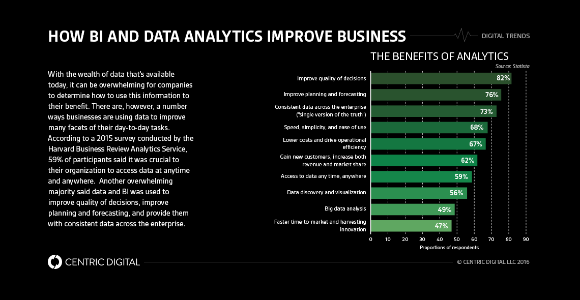
Think infographics and data visualization are one in the same? The difference between these two terms can make a world of difference to your company.The abundance of data available across multiple business touch points has created an exciting era where companies of all types and sizes will be able to operate more efficiently and faster if utilizing these insights properly. Information about everything from customer interaction to operations is available in real-time to assist organizations and individuals in making better decisions. There’s an added bonus too — accessing this information no longer requires the heavy lifting, Excel spreadsheets, or guessing games it used to. Data today is precise, clear, and has a much greater reach.Big data can also have a significant impact on the bottom line. This information is transforming how today’s world is operating in healthcare, retail, media, government, and dozens of other industries and markets. Companies and individuals are utilizing this type of information to help improve and maximize user interface (UI) and user experiences (UX), improve customer processes, determine strategies for mobile, wearables, and other devices, and so much more.So, how can companies take all this incredible information and display it in a way that makes sense for everyone inside and outside of the company?The two most common options are either infographics or data visualization. There is, however, some confusion about these two terms and how they differ.From our perspective, both practices enable data and information to be easily digested, understood, and assessed. So, while the terms ‘visualization’ and ‘infographic’ may have similar meanings—and sometimes are used interchangeably—they mean different things when it comes to how someone wants to tell the story of their data.
What is an infographic?
An infographic is a way to tell a story through compiled data. This is often a static image that represents multiple sets of information on one sheet and is usually about a single topic. These infographics are shown in a way that’s easy to scan and read, using an array of illustrations, iconography and typography. This way of displaying stats and information is pleasing to the eye—especially considering that 50% of the working portion of the human brain is dedicated to visual functions.Another thing that separates an infographic from data visualization is that an infographics are mostly created manually. This means you need to provide a graphic designer or other design professional with the relevant information you want in the infographic and they create a concept based on the data.This McDonald’s illustration is an excellent example of an infographic. From the storytelling device through the graphics to the iconography of vital data, the Golden Arches display the data in a way that’s easy for readers to understand at a glance.
What is data visualization?
Data visualization is a representation of data which could take the form of maps, charts, graphs and other displays. This method is meant to be used for a deeper exploration the information given (especially if interactive) and is easy to refresh and reproduce the same visualization. The visual elements of data visualization are typically based on science and handled by software.To see an interactive data visualization in action, take a look at the Wall Street Journal’s Billion Dollar Startup Club. With the help of the Dow Jones VentureSource, this visual allows viewers to track venture-backed private companies valued at $1 billion or more. You can manipulate the displayed criteria, which gives viewers a glimpse into how the data breaks down by date, region, and industry.Overall, data visualization offers access to customizable, high-touch and easy-to-read executive dashboards and other resources to make it easy and efficient for executives to take away actionable insights and turn them into smart decisions.Each of these ways of displaying stats, data, and other information can be effective for sharing information. However, to determine which is best to use, an infographic or data visualization, you’ll need to first identify your target audience. Who are you sharing this information with? What is their skill set or ability to digest the information you’d like to share? How in-depth do they want to explore the data? A thorough knowledge of your audience and what they want to get out of the data is crucial to providing the right information via the right method of delivery. A consultant can also help provide this distinction and can do the heavy lifting when it comes to creating either the design for the infographic or the coding for the data visualization.
Contact Us
Centric Digital is no longer active. This site is preserved as an archive. For inquiries, please fill out the form.
© Centric Digital 2025
