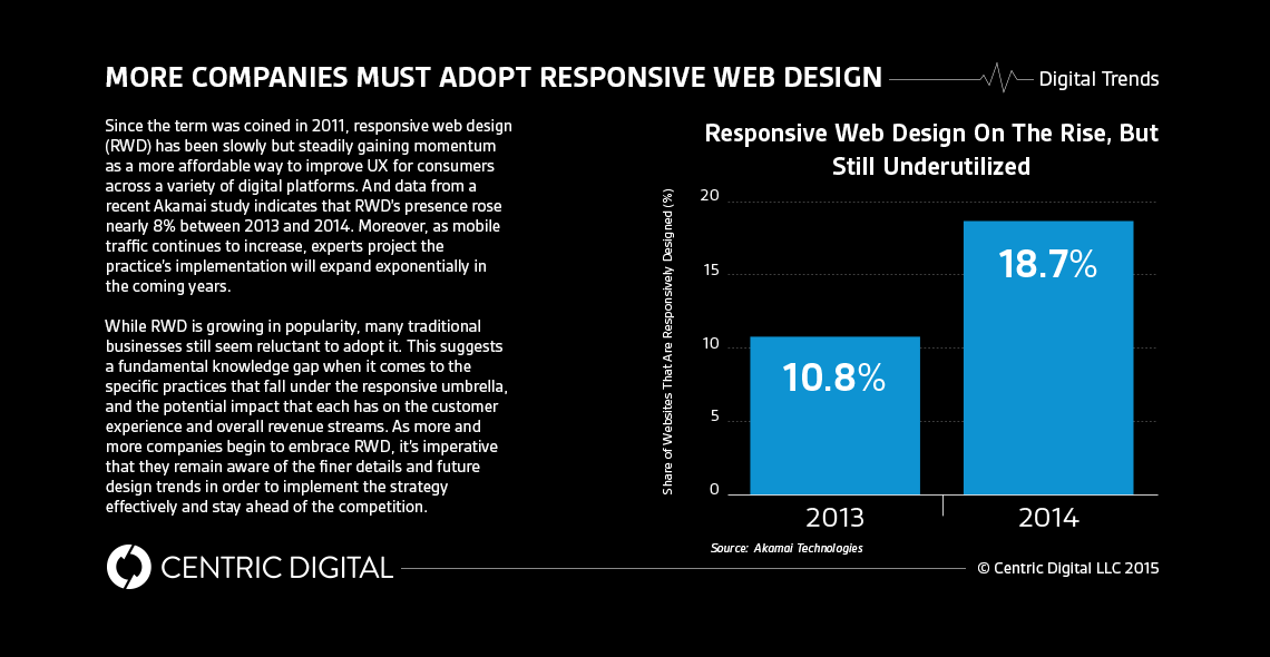
As responsive web design continues to pick up speed, companies need to stay up-to-date with all the new tools and trends of the trade.Though responsive web design (RWD) is still in its relative infancy, the practice is quickly growing in popularity. And as with any young idea experiencing rapid proliferation, RWD’s related practices and strategies are evolving on an almost day-to-day basis.As more developers begin to recognize the inherent value of building websites that are functional and aesthetically pleasing across multiple screens and devices, a company’s competitive edge will largely be determined by its ability to keep its finger on the pulse in terms of future trends in RWD. To that end, here are some of the most important things that organizations need to keep in mind as they implement it into their existing development practices:
A Minimalist Approach
Less is almost always more, especially when it comes to handheld, mobile devices. Removing any extraneous information will create a chic, streamlined environment that will be more visually striking and easier to navigate on smaller screens. Users want frictionless digital experiences, and by incorporating techniques like infinite scrolling, vivid images and graphics, and hidden ghost menus and CTAs, developers can reduce visual clutter and undue pagination, thereby making the site more engaging overall.
Mobile Comes First
Now that mobile platforms have surpassed desktops as the preferred channel of digital consumption, digital assets should be created with a mobile-first mentality. The minimalist approach necessary to optimizing a site for smaller, mobile platforms usually translates well onto bigger screens, but this is generally not the case when it’s the other way around.
Material Design
In an effort to create a more engaging visual environment, many developers are using elements from the physical world to inform their digital designs. By using flat designs that retain a sense of the tangible world, designers can create a relatable yet compelling environment across a variety of digital platforms.
Sensor Integration
Sensors are taking responsive design to a new level, as factors like time of day and location can now be combined with screen size to dictate what kind of content users are being fed. For example, if you’re using your laptop at a coffee shop in Paris, the site would display lengthier, copy-driven content with a geographic tilt towards French subject matter. But say you’re using your mobile phone on a train from Paris to London -- now the content is more image-heavy and the focus shifts from French to British-related topics as you travel.
Seamless User Experiences
In the end, RWD isn’t just about cutting costs for developer; it’s an important step for businesses looking to create an omnichannel marketing platform. Omnichannel is all about building a seamless, consistent experience across a variety of channels, and a site that has the ability to maintain its overall character and structure while optimizing itself for each particular platform is an integral part of this equation.
Contact Us
Centric Digital is no longer active. This site is preserved as an archive. For inquiries, please fill out the form.
© Centric Digital 2025
