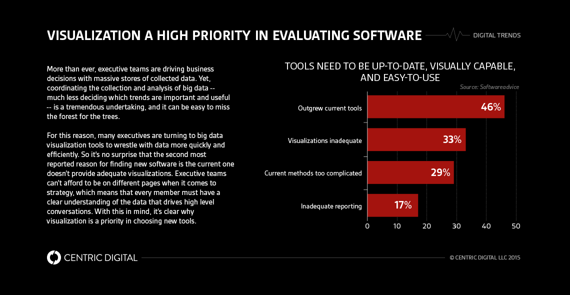
In an age with nearly limitless information, visualization is the key to telling data’s story and making informed decisions at the executive level.Most leading companies have a significant digital component to their operations and services, and many rely on big data to make smart decisions. That means executive teams have to contend with truly massive amounts of data in many different forms. As smart as any person is, it’s impossible to sort through it all alone and make heads or tails of the information -- especially when time is short and there are ten thousand other things to do.Big data visualization is the easiest way for executive teams to identify complicated trends quickly and tell data’s story. Visualizing is actually the most intuitive way for people to digest information -- hence the skyrocketing trend of infographics in the last decade -- and enables stakeholders to communicate information in a simple way to other team members.
The Big Picture
It may be that visualization is so popular today because it’s not really anything new. Over two-hundred years ago, William Playfair used graphics to illustrate economic and political ideas. Famously, the astronomer Michael Florent van Langren used graphs to illustrate geographic distances as early as 1644.Pictures are universally applicable for teaching purposes, which is why infographics have become a tool of choice for elementary school teachers to better illustrate both math and non-math related information. In a similar way, chemistry teachers have long used atom molecular models to describe otherwise unreachable concepts.The common thread, of course, is that we process information more rapidly and remember it more clearly when we can assign visual images to it. Researchers at the University of Pennsylvania School of Medicine have actually demonstrated that that human eye sends visual data to the brain at roughly the same rate as an Ethernet connection (10 Mbps), which goes a long way to explaining why data visualization is so helpful. In fact, 70% of all our sensory receptors are in our eyes.
Food For the Brain
And if the rising popularity of visuals is any indication, then our brain clearly loves pictures -- visualized information has grown 400% in literature since 1990, 9900% on the internet since just 2007, and 142% in newspapers between 1985 and 1994. And it seems that this trend has been enormously helpful; 80% of people remember what they see and do, while just 10% what they hear, and 20% what they read.And there’s no real reason to not put those trends and insights to use. At the same time, we need to (begrudgingly) accept that our executive teams are not super humans. The more your business grows and the more data accumulates, the more it can become a burden to parse, process, and pull out actionable insights. Viewing that data in a tabular, disjointed format (like spreadsheets) will necessarily limit a team’s ability to “see” the data and connect unobvious trends.However, good data visualization tools empower an executive team to: remember information better and more comprehensible; make smarter, more informed business decisions; and understand time trends in data.All said and done, data visualization is a must for executive teams today. On the one hand, spreadsheets are inordinately difficult to visualize, especially with many disconnected data sets. On the other, data visualization makes the interpretation of that data easier and greatly enhances a person’s fluency with and recall of the data. The collection and analysis of big data takes an extremely coordinated effort, and creating interactive and engaging graphics goes a long way towards aligning a team’s efforts.
Contact Us
Centric Digital is no longer active. This site is preserved as an archive. For inquiries, please fill out the form.
© Centric Digital 2025
