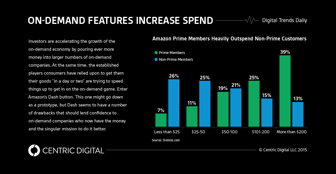
Amazon just announced a new initiative that offers Prime subscribers the opportunity to install wireless “buttons” around their home. Sounds weird, right? It’s also potentially bad business.The concept behind the new Amazon Dash button is simple: when customers are running low on a certain item, they can press a small, branded button that initiates an order to Amazon, which will ship the item to the customer’s home immediately. At first glance, these “Dash” buttons seem like a relatively novel, even good idea, but the concept leaves a lot to be the desired.
What’s the Idea Behind Dash?
Some people love the idea, but a growing majority are echoing John C. Dvorak of PC Magazine in his belief that it’s “ludicrous.” Many spheres of Twitter actually thought that the launch was an April Fool’s Day prank until Amazon confirmed that it was, in fact, an actual product. Not only does the concept of an actual, physical button seem somewhat outdated, but the prospect of having them placed throughout the home seems a little unusual as well.There’s no doubt that a collision of many factors led to the creation of this tiny button, chief among them being the hefty deals that Amazon must have made with companies like Tide, for instance, which is blatantly promoted in the Dash promo video. Other companies like Bounty and Gillette also have made deals with Amazon Dash, apparently because they make “important things you always run low on.” Clearly, the service isn’t exactly comprehensive, and there’s no doubt that there were some behind-the-scenes pushes and shoves involved in the development process.The issue, though, isn’t what the button actually does, but what it fails to do. In the context of the greater Internet of Things movement, this initiative seems like a wasted opportunity for innovation in favor of a misguided branding attempt. Amazon could have much more effectively and simplistically integrated this “button” into their larger business model, allowing the order to be initiated from a smartphone or tablet — an online or in-app button ostensibly makes more sense than a literal button, and would create a far more sustainable system. Instead, customers will have little awkward buttons placed sporadically throughout their homes. Swing and a miss, Amazon.
Who Has the Right Idea?
On the other hand, take a company like Google, whose similar service, Google Express, allows you to order virtually anything you want and have it delivered the same day. Though it’s only established in seven cities so far, and it remains unclear whether it will ever become profitable, the service itself makes sense. It’s unobtrusive, gimmick-free, and brings more people to Google’s platform — especially their payment service, Google Wallet.Other companies like Uber have tried offering services like lunch and dinner deliveries, another clever move to expand its platform into other branches of the e-commerce market. It seems like this is the kind of expansion that Amazon was aiming for with Dash, but several aspects of their planning and execution seem misinformed.So why not just integrate the Dash concept into the Amazon app? The most successful Internet of Things technologies minimize excess and effectively automate each step in the purchasing process — with this criteria, the creation of an actual button seems, in many ways, like a step backwards. Though the Dash button is certainly a move towards greater IoT penetration in American homes, it’s not quite the development we would expect from one of tech’s biggest players. Something more automated and more integrated is undoubtedly feasible, and hopefully, Amazon will get the feedback it needs to readjust and recreate its strategy.
Contact Us
Centric Digital is no longer active. This site is preserved as an archive. For inquiries, please fill out the form.
© Centric Digital 2025
